Monday, January 10, 2022

The Tree in Me by Corinna Luyken


When you think about picture books I am sure you think about the combination of words and illustrations and of course both are very important but in this post I would like to reflect on the importance and variety of illustrations themselves found in the books we share with our children.

I am by no means claiming any expertise in this area.  There are picture books that contain art I love, picture books that contain art I truly appreciate and of course picture books where the art style or images created by the illustrator do not appeal to me. Surely these reactions are formed by experience. This why I argued previously that we should try to share a range of picture books with our students making sure to add titles from around the world.

In her book Looking at Pictures in Picture Books (Thimble Press 1993) Jane Doonan delineates the value of the visual element in picture books:

  • Pictures provide children with 'sensuous pleasure for the eye'.
  • Pictures are a 'means to an end - an aid to literacy and language development'.
  • Pictures enable the book 'to function as an art object. ... The value in this case lies in the aesthetic experience ... ". 
The picture book as an art object is the focus of this post. 

Some parts of a picture book that you need to notice:

  • Size and Shape of the book itself
  • Cover
  • Endpapers
  • Choice of Paper
Looking at the art or illustrations you might notice
  • Style: Charcoal illustration; Ink illustration; Woodcut illustration; Watercolor; Pencil Illustration; Collage Illustration; Acrylic Illustration
  • Type of illustrations: Vignette; Spot; Framed; Full Bleed
  • Size of the illustrations
  • Layers of details
  • Colours
  • Perspective and Point of View
  • Emotional impact of the illustrations

Talking about the illustrations in a picture book:

  • Are the pictures or the words more important in the book? Or do they both matter equally?
  • Do you like the pictures? Why or why not?
  • What about the pictures do you notice?
  • Would the story be different if it had no pictures? If so, how? 
  • Do you think this book is art? Why or why not?
Adding another layer to this conundrum is the issue of comparing apples and oranges. By that I mean digital art compared with more tradition art techniques. Water colour paintings against black and white pencil creations. Realistic images compared against abstract ones. Realistic faces or cartoon-style ones. And what of artists who use other techniques such as collage or photography?

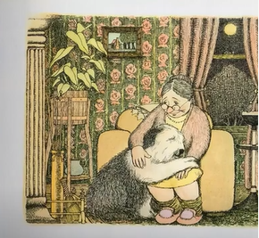
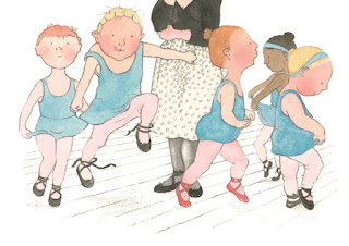
Take a look at these illustrations which are just the tip of a huge iceberg of possibilities. Here I want to show a range of styles from around the world:


I talk like a River illustrated by Sydney Smith


Rosie's Walk illustrated by Pat Hutchins


Mr Chicken illustrated by Leigh Hobbs


How to Read a Book illustrated by Melissa Sweet


Goodbye Autumn, Hello Winter illustrated by Kenard Pak


Forever illustrated by Beatrice Alemagna


Eric illustrated by Shaun Tan


The Widow's Broom illustrated by Chris van Allsburg


See more illustrators and illustrations on these sites Let's talk Picture Books and The Art of the Picture Book. Also take a look at this resource from the Victorian State Goverment -  Exploring and creating picture story books. I also found this resource 19 Inspiring Children's Book Illustrations.

Now onto my book for today - The Tree in Me.  Here is the text from the first six double spreads.

The tree in me is part apple, part orange-pear-almond-plum (part yummm), part shade, and part sun.

Think about the art you might use for these words? Think about the colours? Think about the page turns? Think about the font? Think about the position of the text on each page? 

Publisher blurbThrough poetic text and exquisite illustrations of children reveling in nature, this picture book explores the various ways we as human beings are strong, creative, and connected to others. Each of us is like a tree, with roots and fruit, and an enduring link to everything else in nature. "The tree in me is strong. It bends in the wind, and has roots that go deep . . . to where other roots reach up toward their own trunk-branch-crown and sky."


The Tree in Me has beautiful end papers. Corinna Luyken employs a very appealing colour palette of fluorescent pink, orange and grey. The text is placed carefully on each page but never in the same position which adds interest. Some illustrations are centred on the right or left of the page while others are spread across both pages.The perspective changes with each page turn. The face of the young girl conveys her huge emotions. Some images have an almost misty feel which adds an atmosphere and also amplifies the light filled scenes. YES this book is certainly filled with illustrations which appeal to me and I think will appeal to young readers. 

My conclusion - I am still considering the question of illustrations and how to judge their value or worth or aesthetic qualities. How to say one is good, one is excellent while another is less successful.  Judgement about the illustrations in picture books is subjective but, as with all artistic and other endeavours, some creators are more skilled than others and so I think we can make a judgement call and (even if it is a personal preference) nominate some illustrators and illustrations as personal favourites but this judgement can also be informed by knowledge of a range of illustrations and a close examination of the art using some of the points I made at the beginning of this post. 

If this topic interests you then I suggest exploring award winners from around the world as a way to build your field of knowledge - to inform your experience - to extend your visual experience -  to explore exemplary illustrations.

Here is an extract from the criteria used by the CBCA here in Australia for the New Illustrator award:

ILLUSTRATIONS - 

  • The quality of medium use is excellent for the intended audience. 
  • The illustrations are fully entwined with all the text on page and this enhances/augments the storyline. 
  • Illustration/s reflect/s the quality of the text on each page. 
  • The layout of illustrations provides a balance of space and text. 
  • There a consistent quality of illustration throughout the book. 
  • The artistic style, media and artistic elements of colour, line, shape and texture match to the written text or idea. 
  • The illustrations in the book also help to fully engage the reader who can identify with characters. 
  • The use of various media by the illustrator contribute to the aesthetic qualities of the book. 
  • Illustrations are credible and appropriate in the use of cultural material.

MOOD - 

  • The illustrator creates, develops, varies and sustains the mood successfully, engaging the reader fully. 
  • The illustrator’s work and colour palette augment the mood of the book.

No comments: